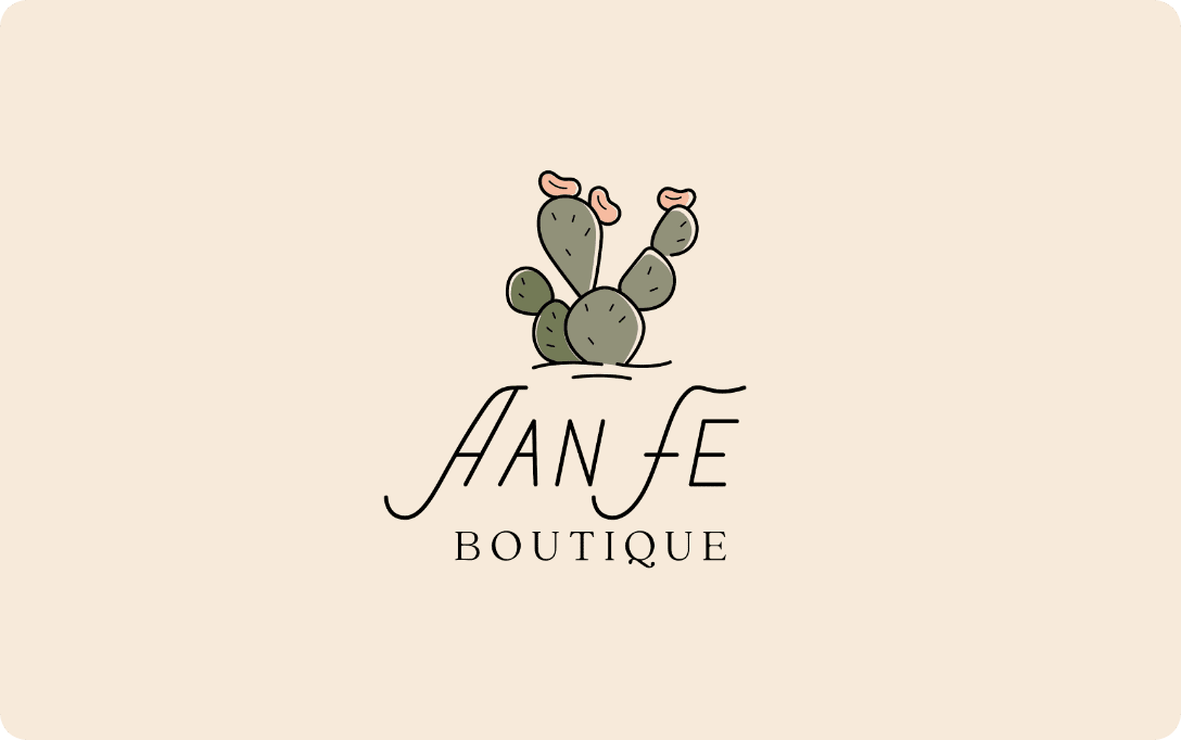
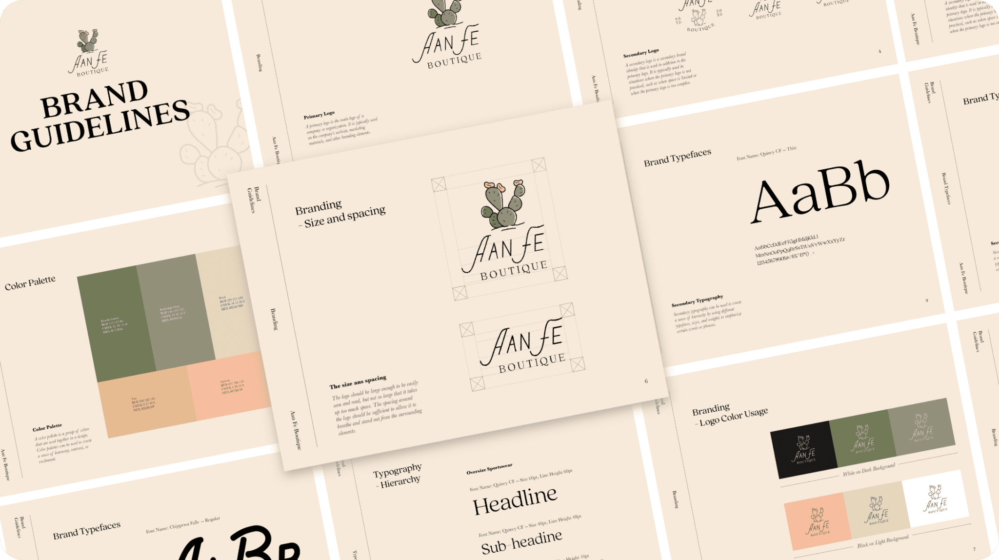
Founded by three sisters who saw a need, the Aan Fe vision is to create a one-of-a-kind boutique specializing in plus size and maternity fashion. The brand name includes the three sisters’ initials plus “Fe,” which means “faith” in Spanish. Campaignium was delighted to create a unique logo reflecting the sisters’ Arizona roots, along with a branding guide that sets Aan Fe apart from the rest.
Thanks to the outstanding work of the Campaignium design team, our original logo design earned silver ADDY honors from the American Advertising Federation of the Heartland.
AAF Heartland: Websites – Silver Award
Reflecting the Vibrant Spirit of the Southwest
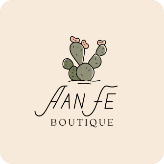
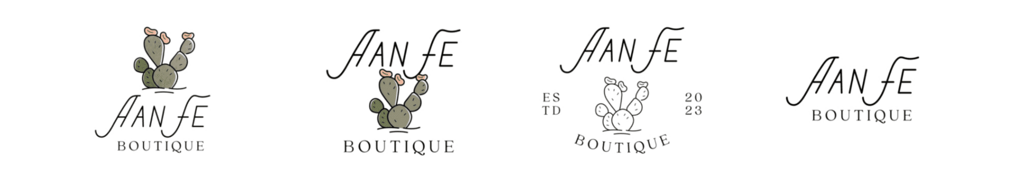
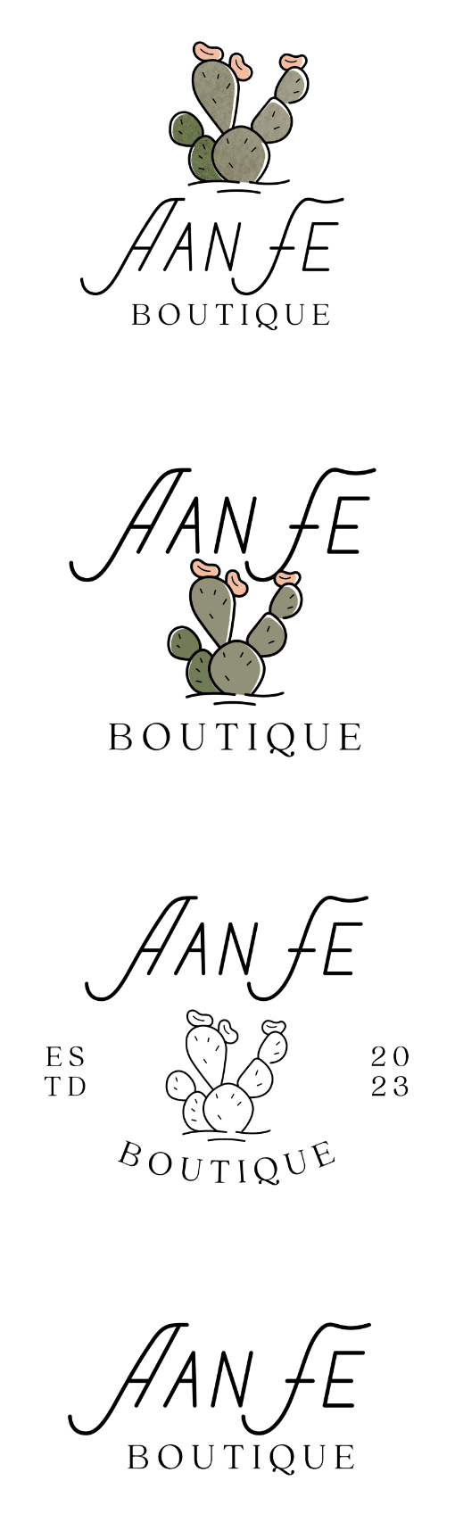
Aan Fe’s founders looked to nature to inspire the brand’s logo and color palette. Campaignium responded with a gorgeous, eye-catching logo adapted from a watercolor cactus one of the sisters created. The logo reflects the sisters’ love of the breathtaking desert landscapes in their home state of Arizona and communicates the positive message of the Aan Fe brand.
Alternative Logos
Fresh Elements for New Fashion Ideas
Gorgeous and consistent branding is essential in the competitive world of fashion. Campaignium developed fun, elegant branding elements that reflect the Aan Fe vision of fabulous options for plus size and maternity customers. Along with the custom cactus logo, the guide includes a Southwest-inspired color palette and typefaces that communicate a beautiful sense of style for all occasions.