Since 2011, Mother’s Brewing Company, colloquially known as Mother’s, has established itself as one of Springfield’s premier microbreweries with its wide selection of crafted beers. To continue competing with other breweries on supermarket and liquor store shelves, Mother’s wanted to elevate product visibility by introducing a bold new look to its beers. The brewery teamed up with Campaignium to work on new seasonal beer design material and social media content.
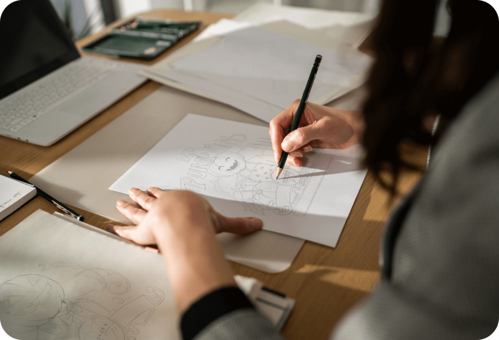
The team at Campaignium didn’t just want to give Mother’s seasonal beers a bold new look; we wanted the branding to jump off the can at potential customers. To do this, the Campaignium design team took the essential elements from each beer’s identity and created a design that could tell the beer’s story.
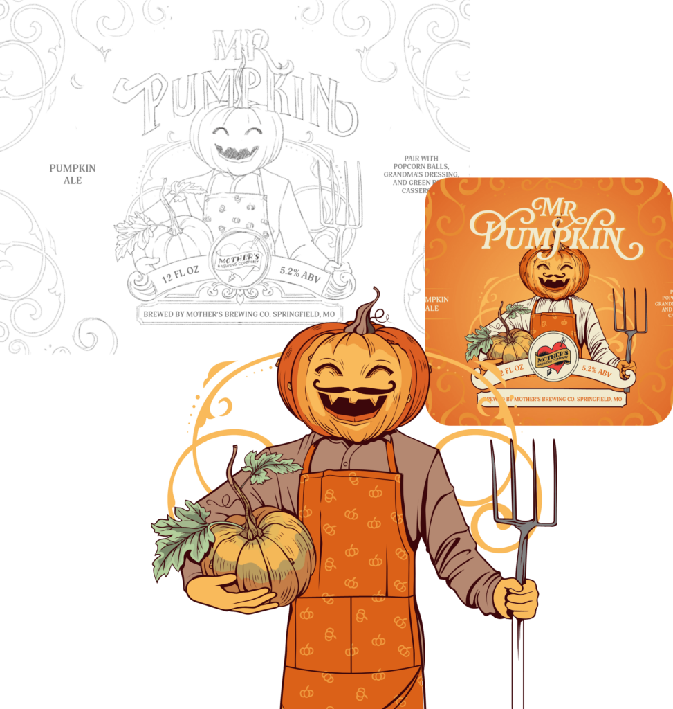
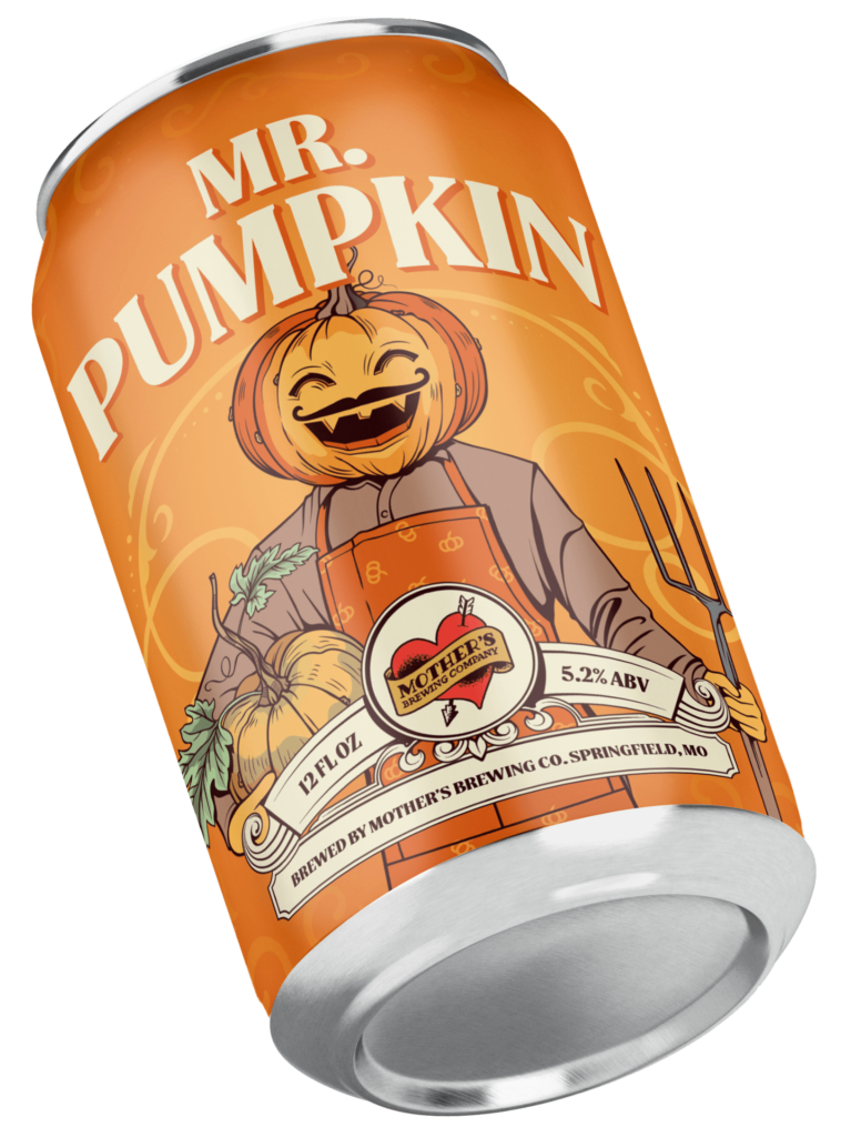
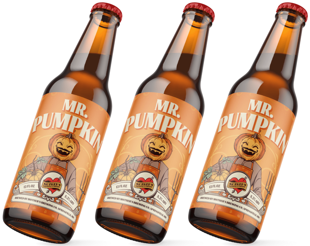
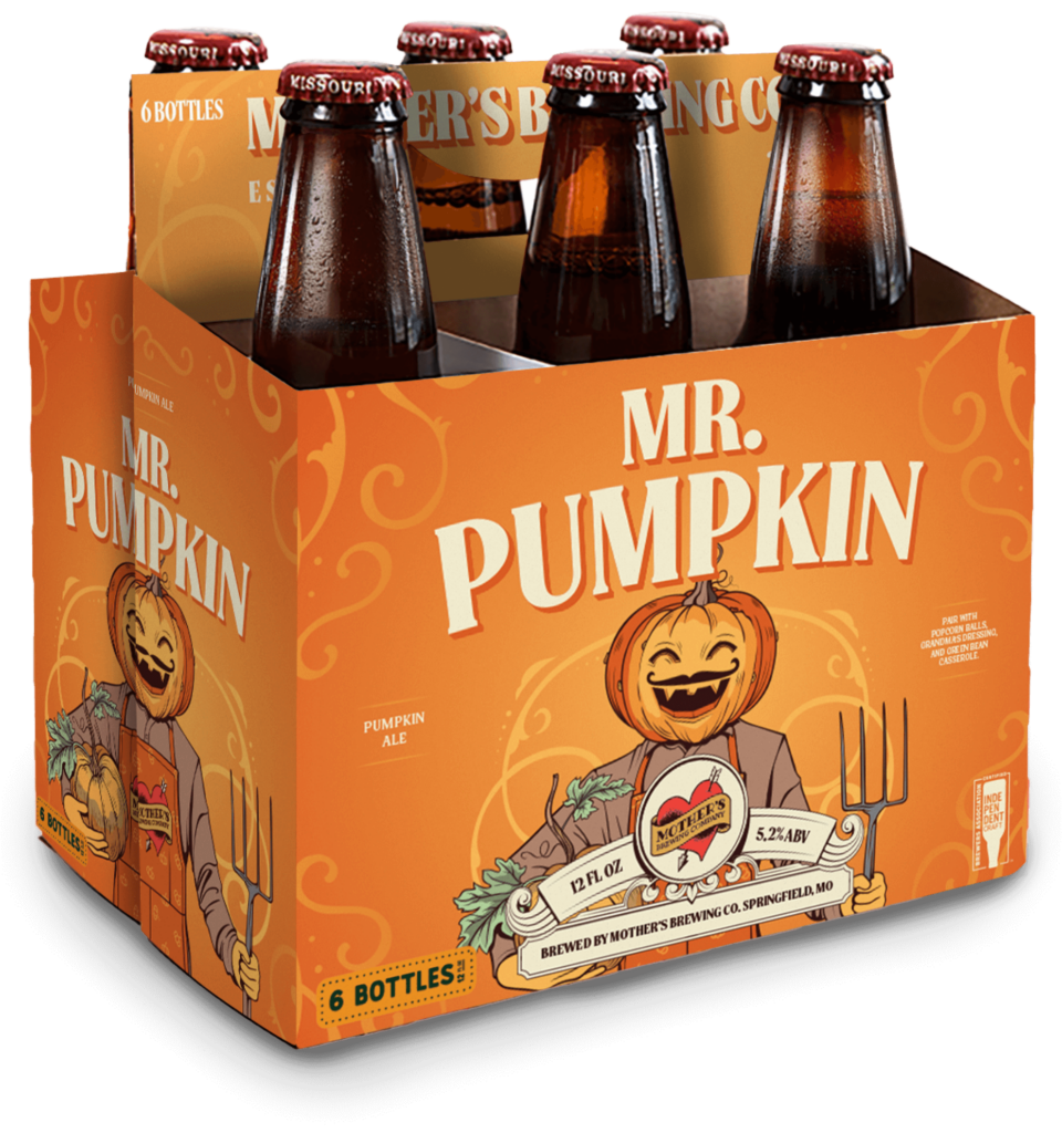
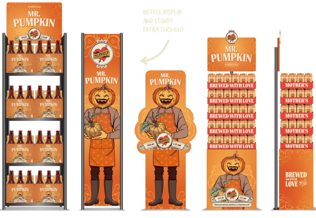
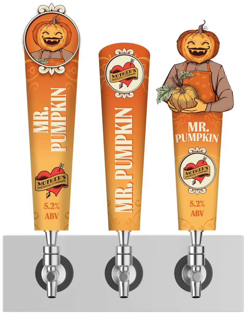
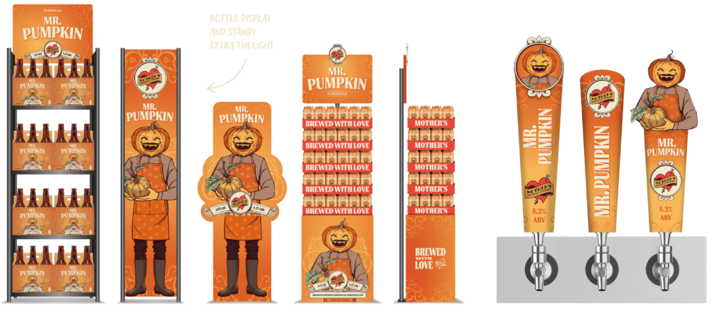
MR.PUMPKIN
The new marketing material brought Mr. Pumpkin’s character to the forefront with new illustrations and bold typography. This bold new take on the autumn classic was designed to help customers identify which beer they were buying and that it was from Mother’s.
From store shelf displays to tap handles, the Mr. Pumpkin character became the centerpiece of this redesign and was integrated into every level of the beer’s marketing.
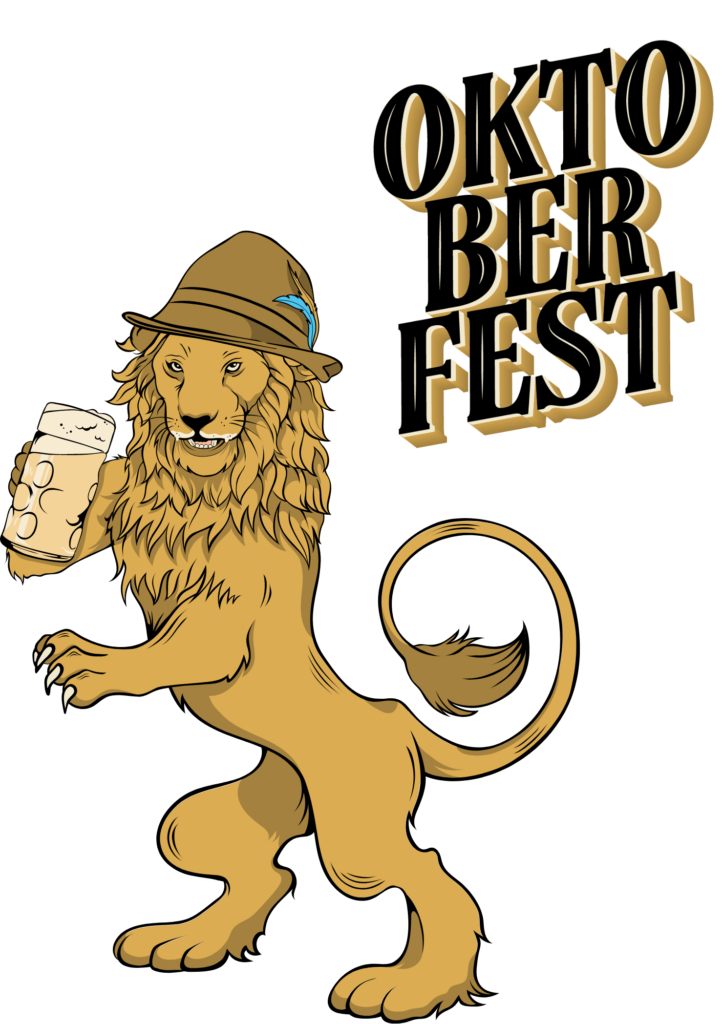
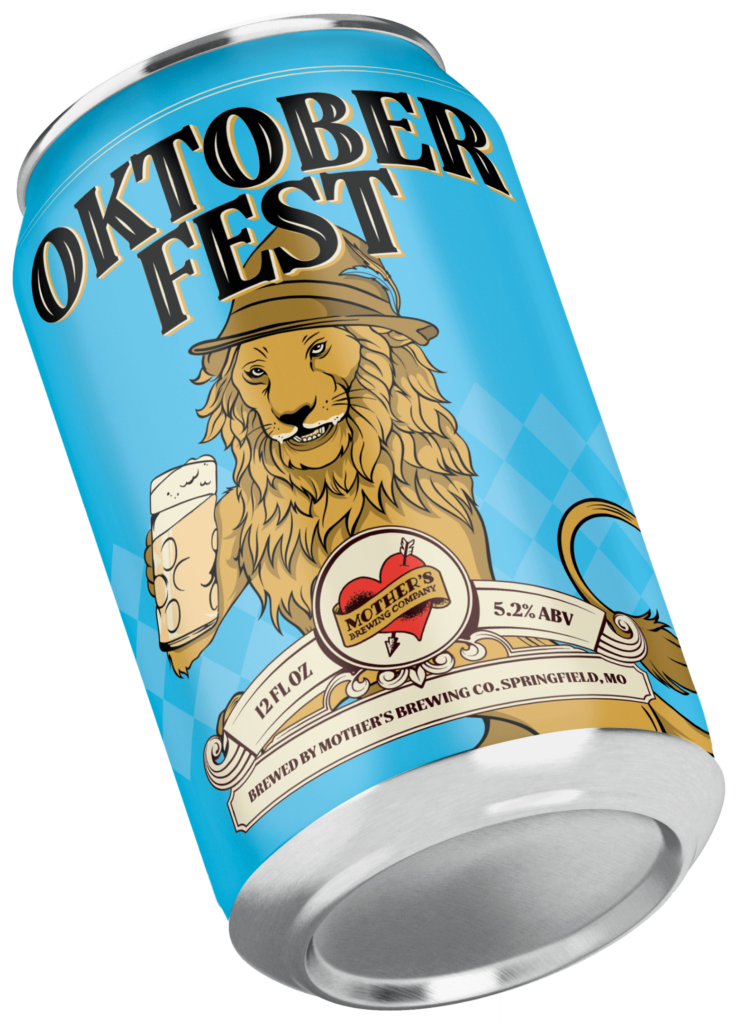
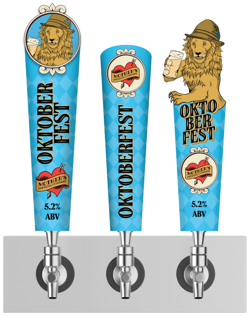
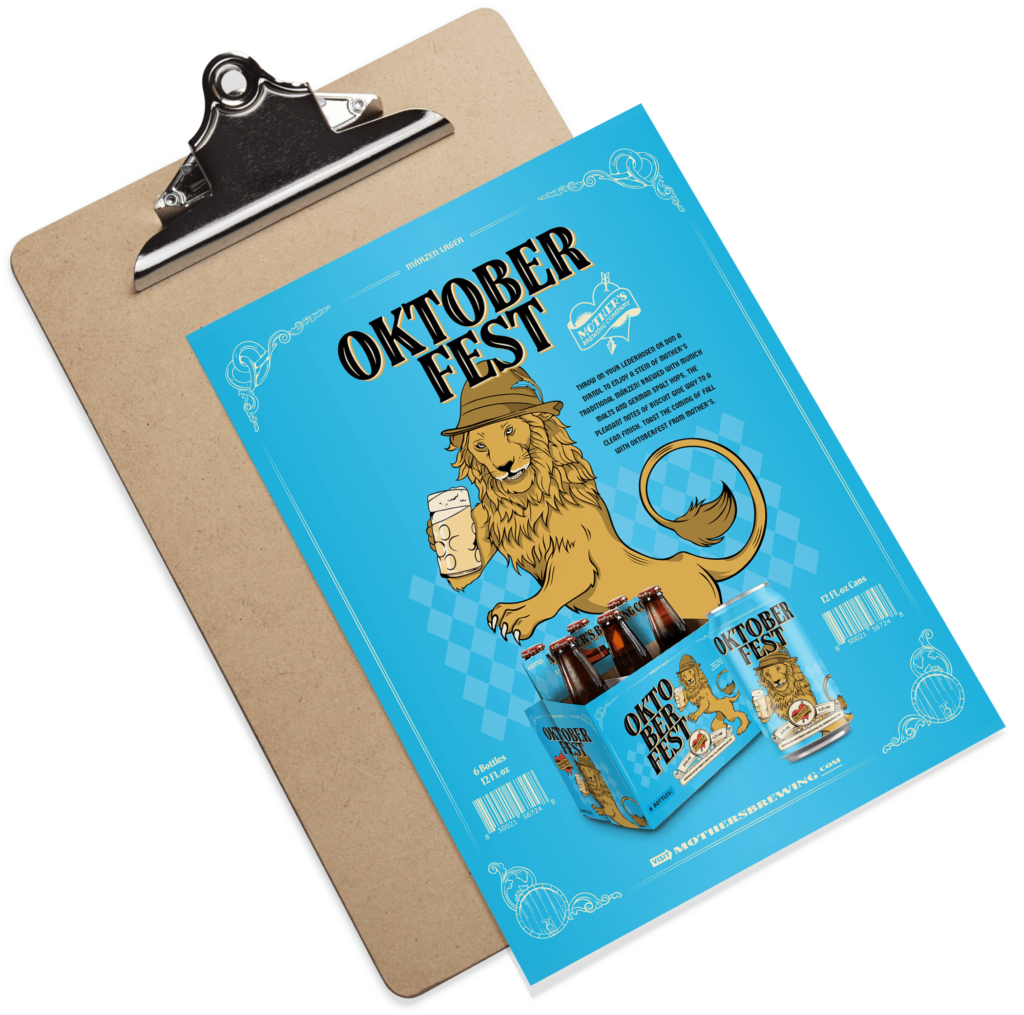
Giving Mother’s Märzen a Mane
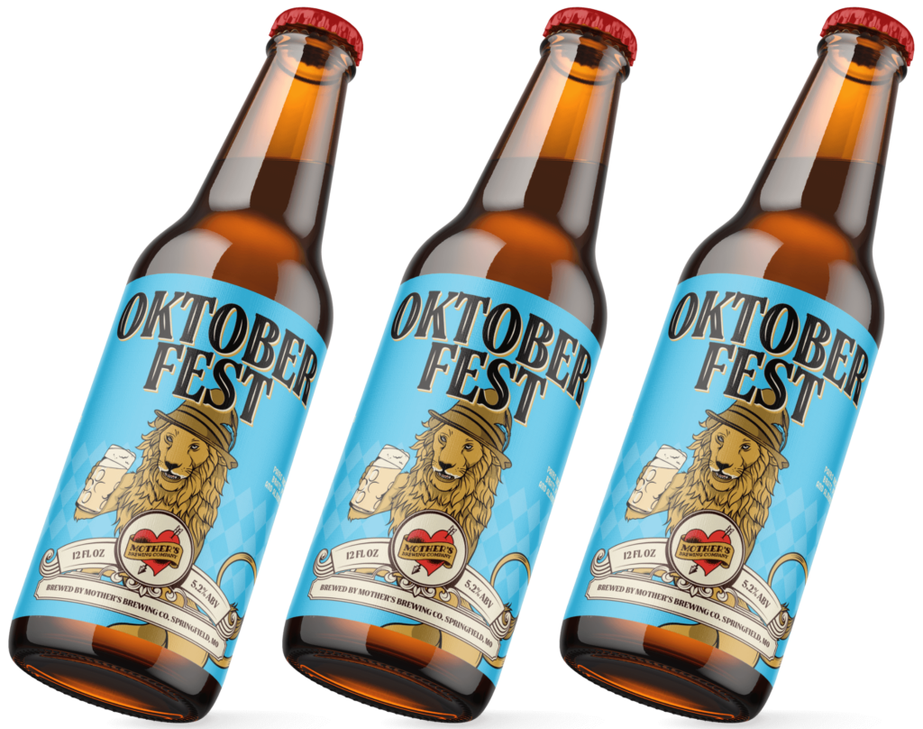
The celebrated history of the world’s most famous beer festival made Mother’s Oktoberfest Märzen Lager a perfect candidate for a new design. With so many breweries producing Oktoberfest beer, we knew we needed to give Mother’s take on the traditional German Lager a bold look.
The celebrated history of the world’s most famous beer festival made Mother’s Oktoberfest Märzen Lager a perfect candidate for a new design. With so many breweries producing Oktoberfest beer, we knew we needed to give Mother’s take on the traditional German Lager a bold look.
OKTOBERFEST
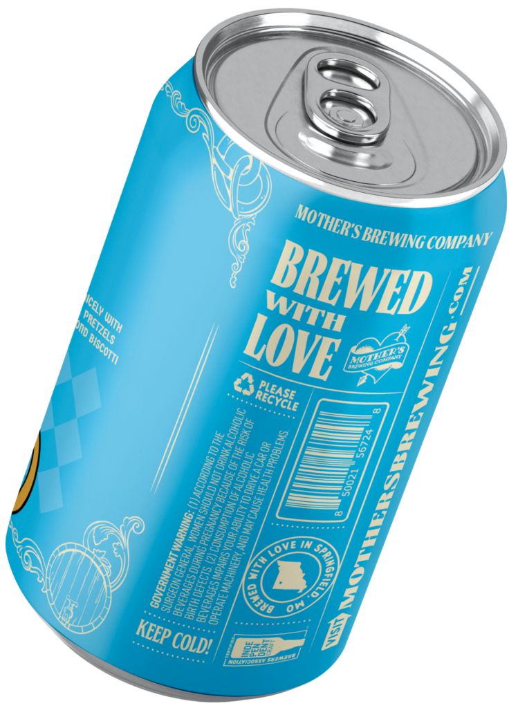
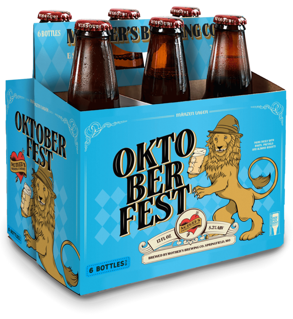
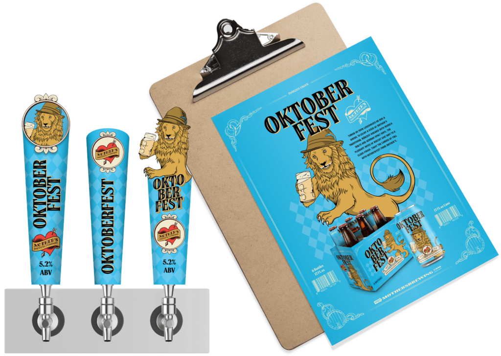
With so many breweries producing a form of Oktoberfest beer, we brought a fun look for Mother’s take on the traditional German Lager. The new look integrates several touchstones of Oktoberfest, including the lion, a symbol of bravery in Bavaria’s history, and the Tyrolean hat, an iconic accessory worn by visitors to the famed event.
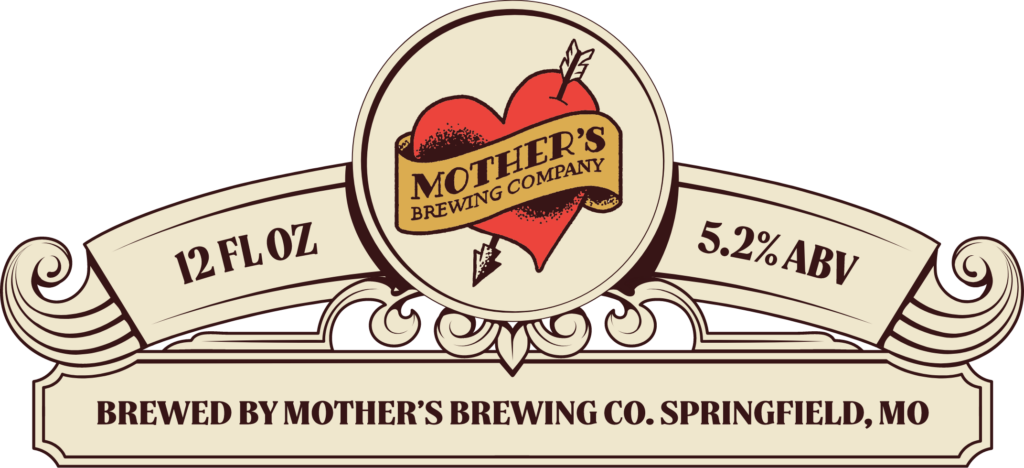
While we incorporated many new design elements, keeping the Mother’s logo intact was critical to our branding effort, which is why you can see it prominently displayed in the banner. Campaignium wanted to deliver a distinct look for each beer without confusing consumers. When you look at these designs, you know you are about to enjoy a crafted brew from Mother’s.
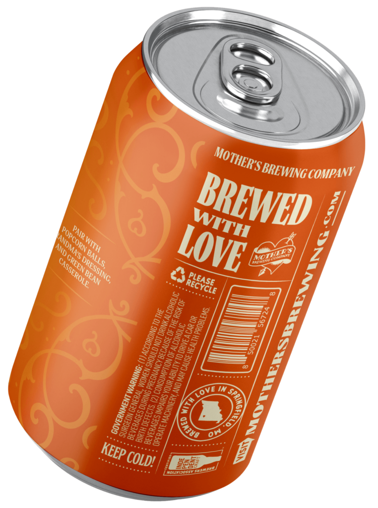
The Mr. Pumpkin and Oktoberfest beers received a redesign for their bottles, cans, beverage packaging, tap handle inserts, sell sheets and point-of-sale displays.